Virat Digital brand identity
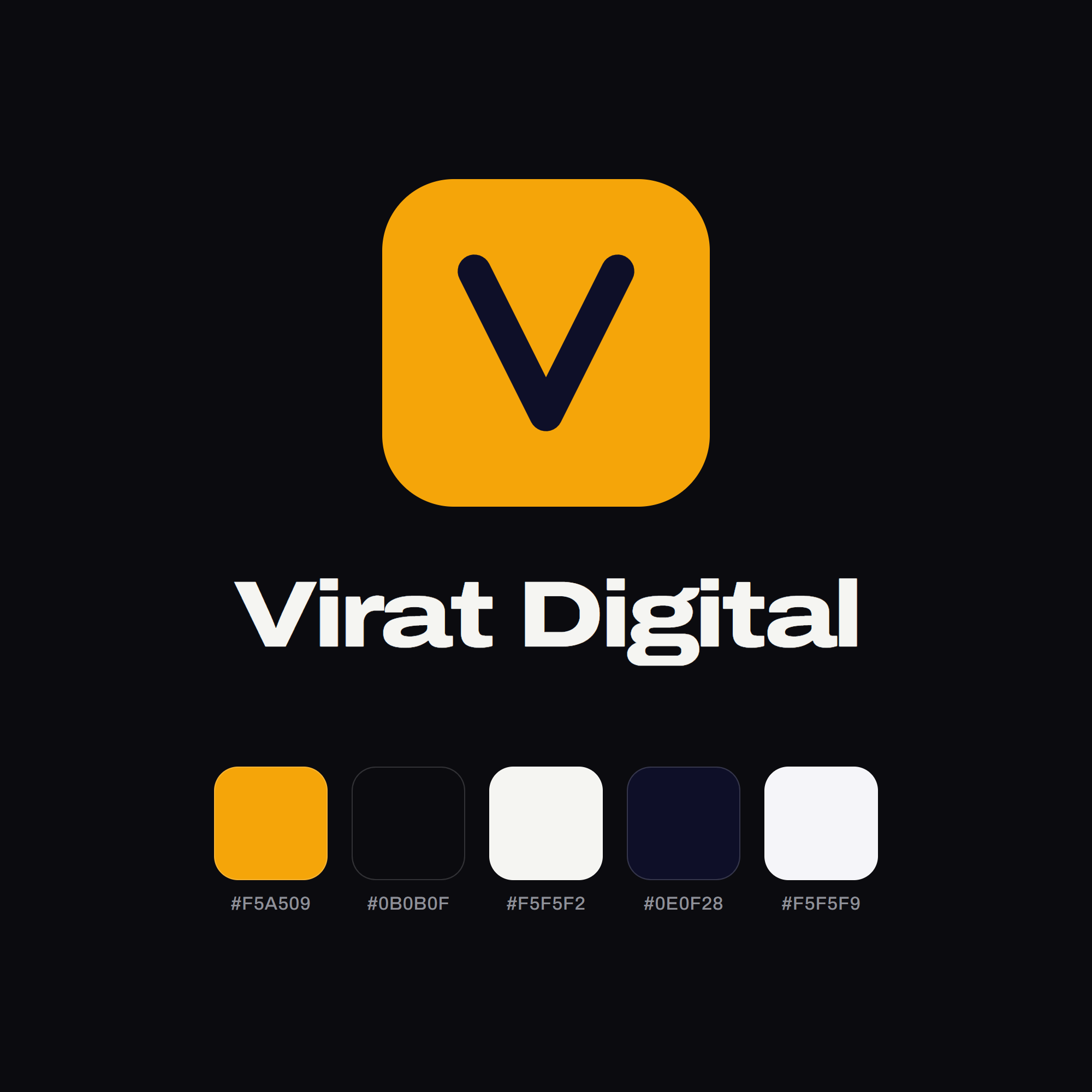
My studio's own identity: a marigold V, Archivo set wide, and one accent across two themes.
The brief
An identity for my own studio that holds up at every size, from a browser tab to a full-width hero, and that one person can apply consistently without starting from scratch each time.
Approach
The mark is a single V, kept from the studio’s first website and recoloured: a marigold tile with the letter in dark ink. Archivo carries the voice, set wide and heavy for headlines (virat means immense) and at normal width for reading.
Colour is one accent and two pairs of neutrals. Marigold marks the next thing to do; near-black and off-white carry the dark theme, ink and paper the light one. Each colour is defined once as a design token, so both themes draw on the same set. The 3D V on the home page was made in Adobe Firefly.